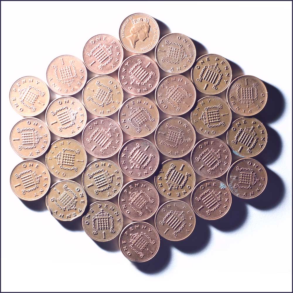
I like Penny best because Pennies is a little milky and washed out and I am always a sucker for higher contrast oomphy pictures! I can't understand how it gets that glow around it though... Very curious!
I copied the layer, inverted it and then set it to 'soft light' and tweaked the opacity a bit. I too like contrasty shots usually, but I like the faded look to it - I think it fits well with the tones of the coins

I like Penny best because Pennies is a little milky and washed out and I am always a sucker for higher contrast oomphy pictures! I can't understand how it gets that glow around it though... Very curious!
ReplyDeleteI copied the layer, inverted it and then set it to 'soft light' and tweaked the opacity a bit. I too like contrasty shots usually, but I like the faded look to it - I think it fits well with the tones of the coins
DeleteI like the close-up because it's ... a close-up, a good one too, we can see each and every blemish on it's face.
ReplyDeleteI like the close up too. maybe because of the color... and the amazing clarity :)
ReplyDeleteThe close up is great because the details are so sharp. I can remember when to 'spend a penny' did cost only one penny.
ReplyDeleteYour penny's are... dangerous! LOL Very cool design on them!
ReplyDeleteI like both shots but think the one of the several pennies could use a level boost to push the colors as those deep shadows are quite cool! Eury
ReplyDelete